

In our previous blogs, you learned how to gauge and analyze the effectivity of your digital healthcare marketing endeavors using metrics from your campaign. But how do you incorporate data analytics into your healthcare marketing strategy?
Before we begin, let’s review.
Three important digital metrics included the following:
1) Unique visitors
2) Bounce rate
3) Average time on the site
But do you know how you can improve each of these digital metrics using different marketing strategies?
Here are simple ways to increase the number of your unique visitors.
Click on each item for more detailed descriptions from our previous blogs:
2) Use social media like Linkedin
3) Post long-form specialized contents and Podcasts
4) Optimize your website for search engines with great content and keywords
5) Send newsletters with links to your website
Data Analytics and Bounce Rates
What about the bounce rate? Is this something you want to increase or decrease? What Google Analytics mean by bounce rate is the percentage of readers who view only one page of your website.
For example, Mr. Smith types “optometrist near me,” and Google leads him to your website’s homepage. He strains to see the letters, and when he scrolls up the page, he couldn’t find the address of your clinic. The tab for contact information is not visible.
Frustrated, he goes back to Google and looks up the next optometrist. This leads him to a different website. Because he only viewed one page of your website (the homepage), he will contribute to your bounce rate. The higher your bounce rate, the less effective your website is in converting your prospects to patients.
So, how do you decrease your bounce rate?
Clearly, you need to target the right audience with your content and make sure they have a good experience when they navigate your website.
How to Improve Your Website to Decrease Your Bounce Rate
- Check that your website has all the components you need to become successful. Read this blog on the components of successful medical websites.
- Check that your Landing Page hooks your reader. How to do that? This blog on creating the right landing page for your website will tell you more.
- Check that your website is doing what you envisioned it to do. Read this blog on how to maximize your website’s benefits.
All the above steps will help decrease your bounce rate, engage your target audience, and draw them to become loyal patients. These will also address the third digital metric mentioned above, that is, the average time your readers spend on your website.
How will you know that your efforts made a significant improvement in your metrics?
It should show graphically using a run chart. To know if the changes you made created an impact or changed the trend, you need at least 10 data points. One up spike or down spike shouldn’t make you jump for joy. You need consistency to know that your intervention is meaningful.
Much like looking at the stock market, you don’t react with every little market movement. You should read the overall trend to come to the right conclusion.
Run Charts to View Your Data Analytics
Creating a run chart is simple. Your x-axis will be the times you measured your metrics, and the y-axis represents the data you’re measuring.
You often use the run chart in healthcare quality improvement. You can do the same to analyze improvement in your digital healthcare marketing using the digital metrics mentioned above.
Compute for the median of your data points and see if you got a trend. You know you have a trend if you have 5 or more consecutive data points that are either increasing or decreasing.
Let’s say after your first three weeks, you decided to add online content in the form of blogs and podcasts and promoted it on social media. You can see if these strategies improved your metrics by looking at the number of unique visitors after the third week.
In the graph below, you see an increasing trend.
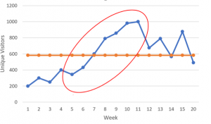
For instance, you decided not to post on social media starting the 12th week. Did you get a new trend? You found a variable pattern. From this graph, it seems that both strategies of producing online content and promoting these on social media were responsible for the considerable increase in traffic to your website.
Based on your results, you can continue using both strategies to maximize the benefits of your online campaigns.
You can do the same for your data on bounce rate and average time on the site. Check any trends to determine whether your strategy is working or not.
Each time you implement a new strategy, always check for trends to see if it improved your metrics or not.
Analyze Your Data with Split Testing
Another way to analyze your data is through split testing.
For instance, you can create two or three versions of your landing pages. See which of these landing pages attracted more visitors to book an appointment or subscribe to your newsletters.
Whenever you tweak any of your strategies, test the new version, and compare with the old.
More ways to analyze data
When running ads, compare different channels so you’ll know where your target market populates and you can invest more on those channels.
There are many ways to handle data. One sure way to mishandle data is to ignore and leave it untracked. You may think you’re doing great, but without the metrics to back up your claim, you may as well be flushing your money down the marketing drain.
We Can Connect You with Patients
And if you’re too busy tracking your patients’ health metrics and don’t have the time to focus on your marketing metrics, we can help you. At the Steeplechase Company, we handle digital data analytics to improve your healthcare marketing strategies, so you don’t waste precious resources on marketing endeavors that don’t convert prospects to patients.
Schedule your practice review here to learn more about how we can help connect you with more patients!